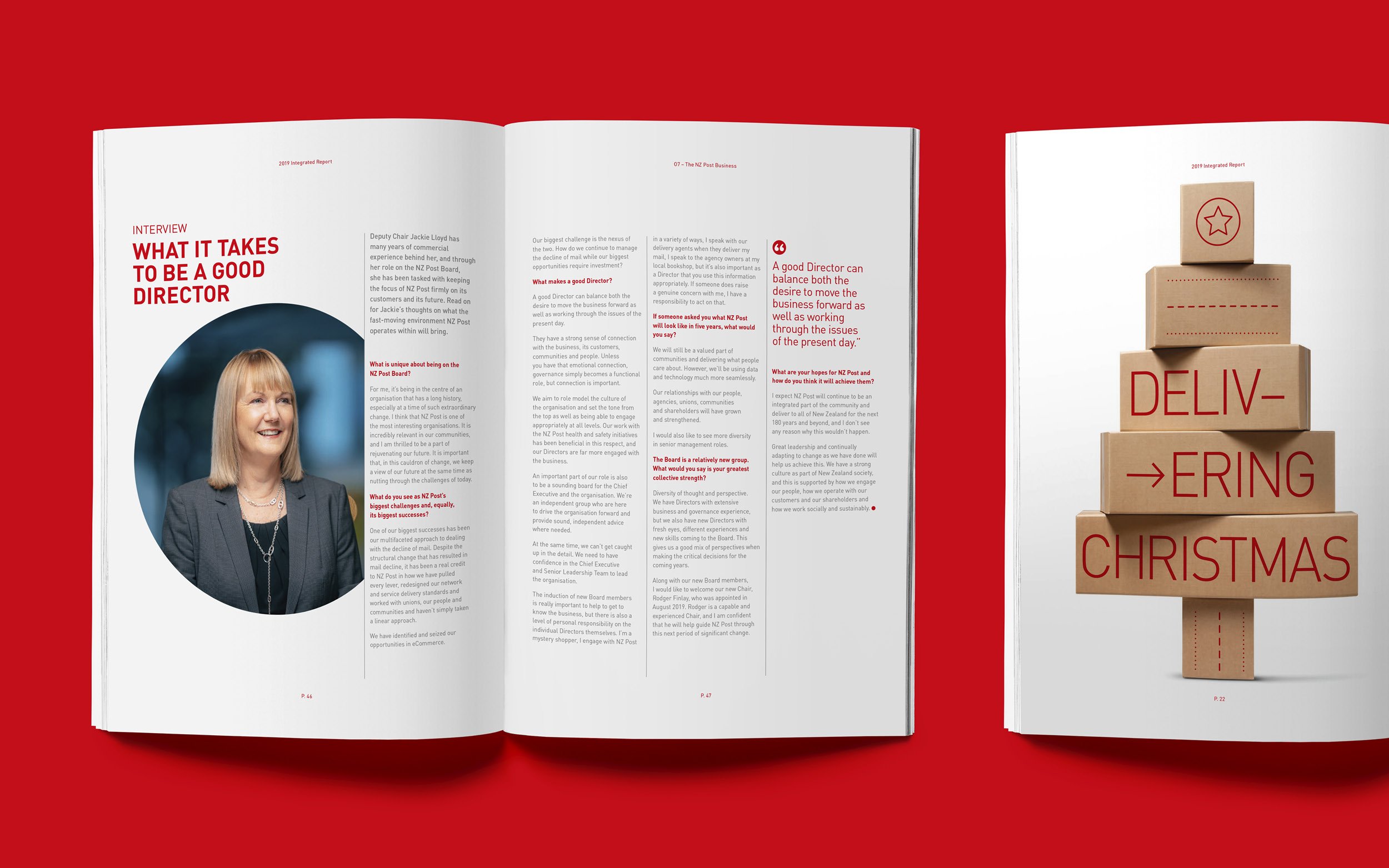
NZ Post Integrated Report
Reporting needn’t be boring. My challenge was to take an existing brand identity and breathe new life into it – in an integrated report format, no less!


The idea was to move it more into the magazine space, with varied layouts, lots of articles and imagery. When we think of New Zealand Post we think of red and white, so those colours certainly needed to be prominent. Each spread was treated individually, while keeping the tone and colours similar throughout – our clients were stoked!
Completed at Insight Creative with Edwin Hooper.
