Victoria University of Wellington
Such a big change to a logo that is near and dear to proud alumni was always going to be a challenge. This was an exercise in restraint and craftsmanship.
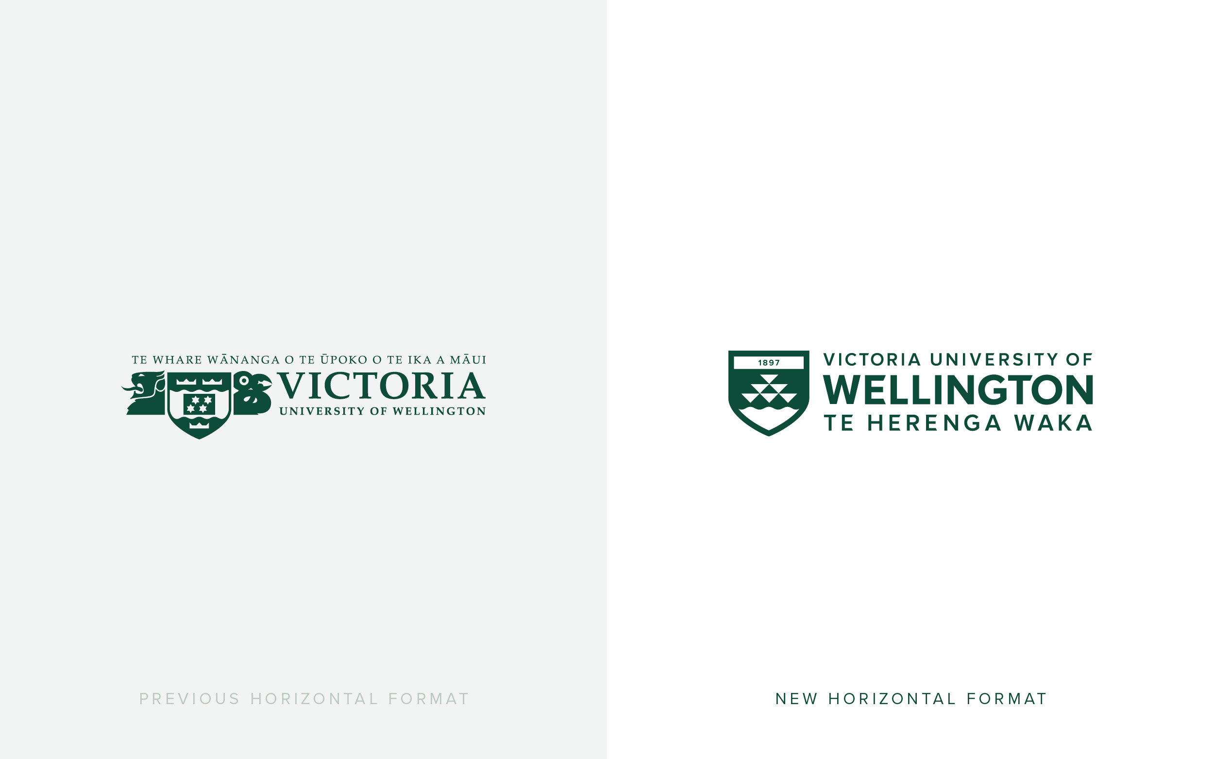
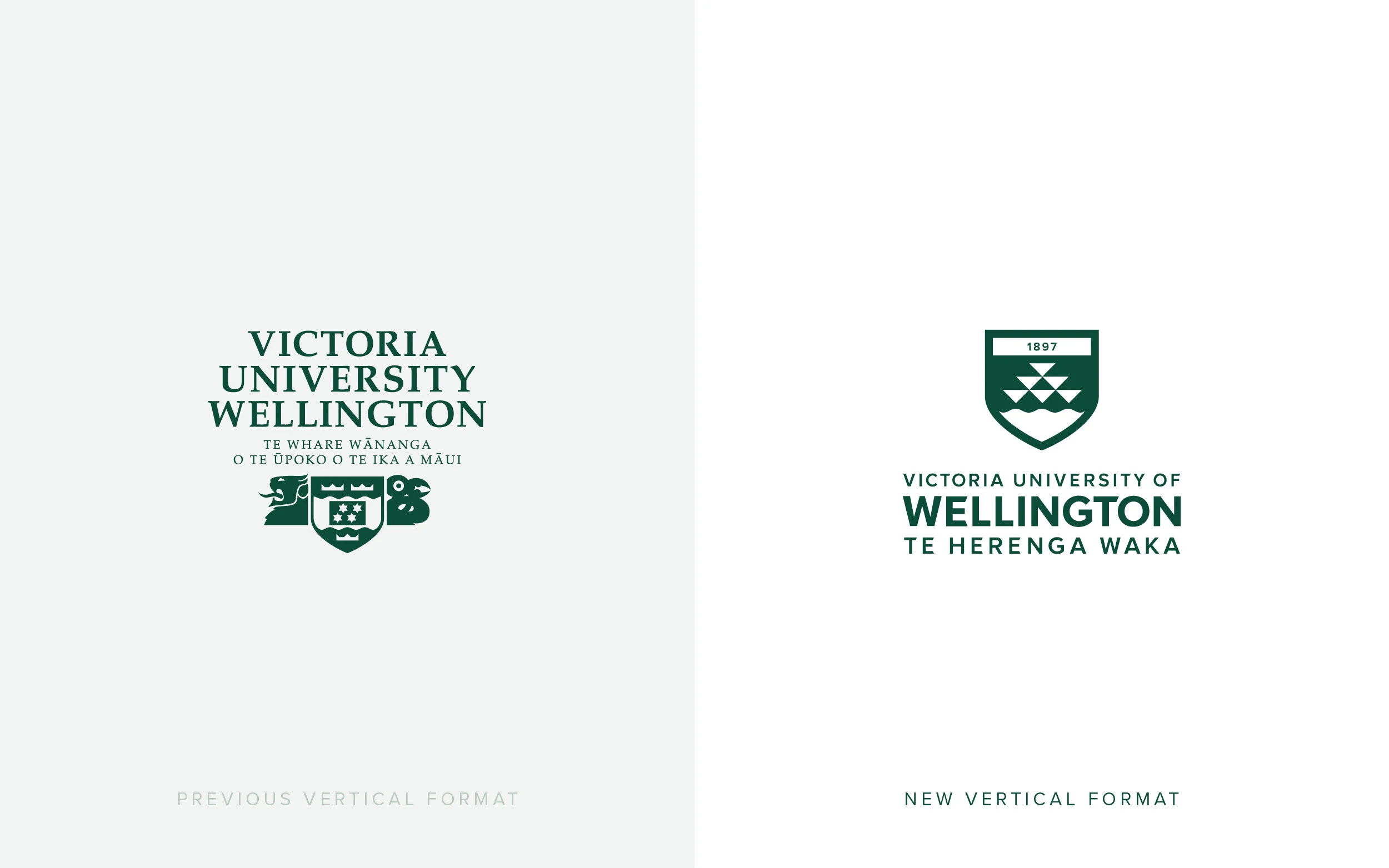
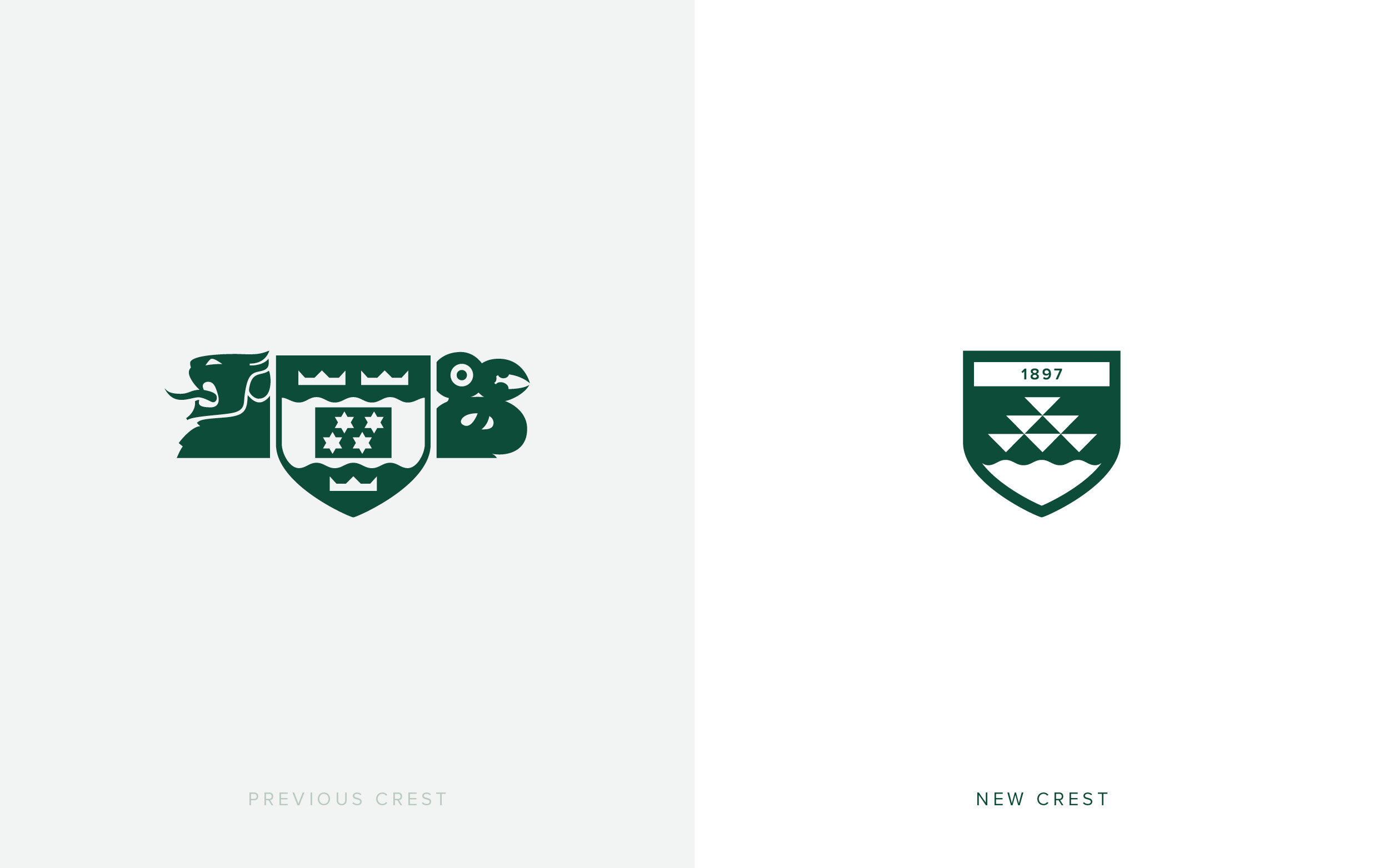
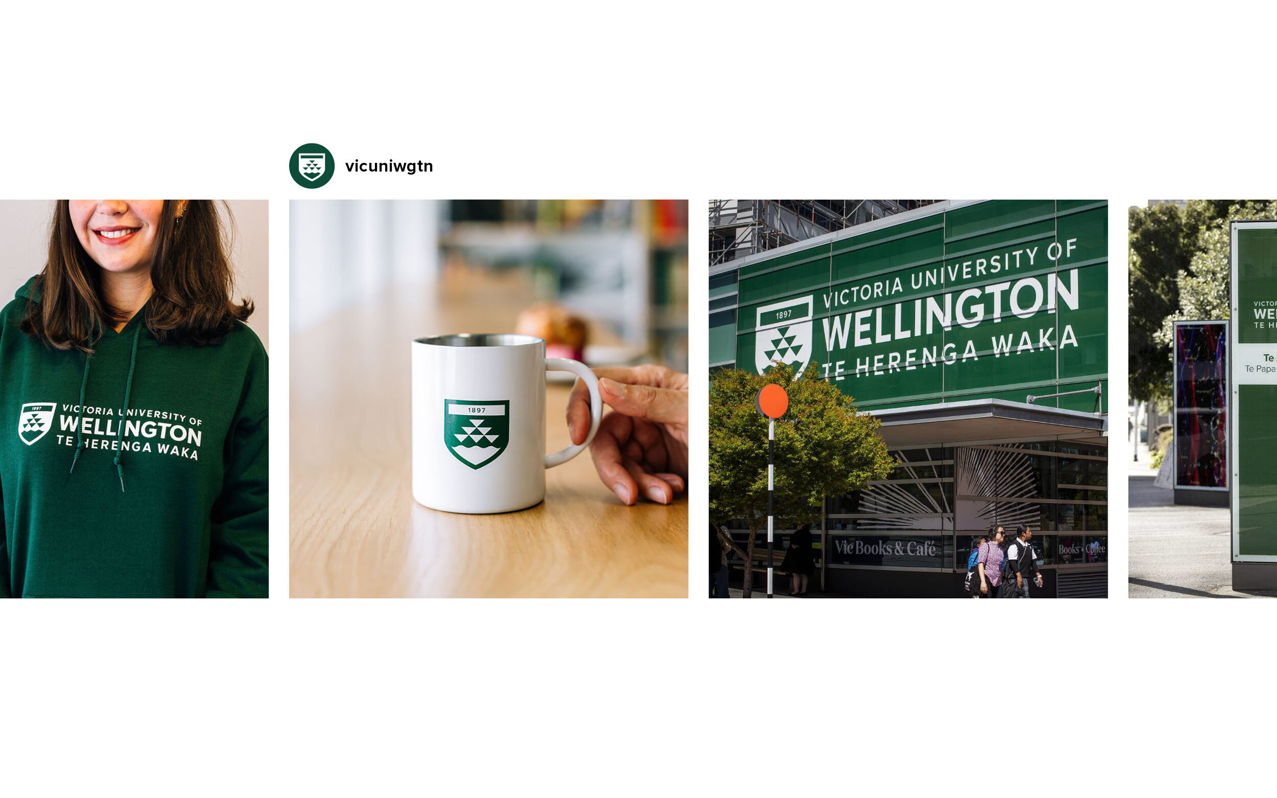

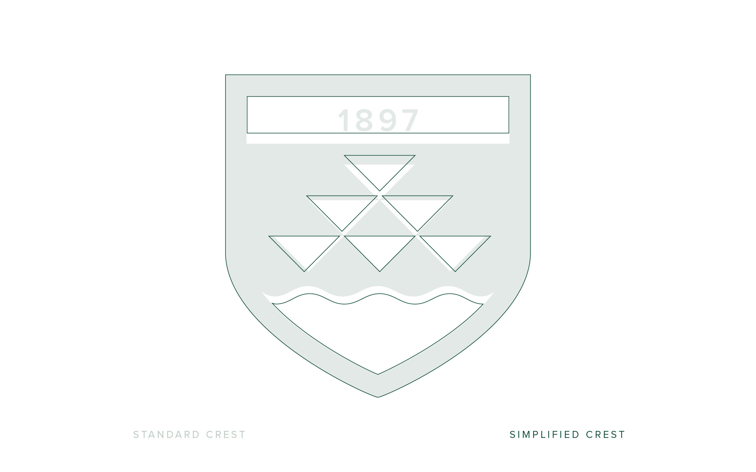
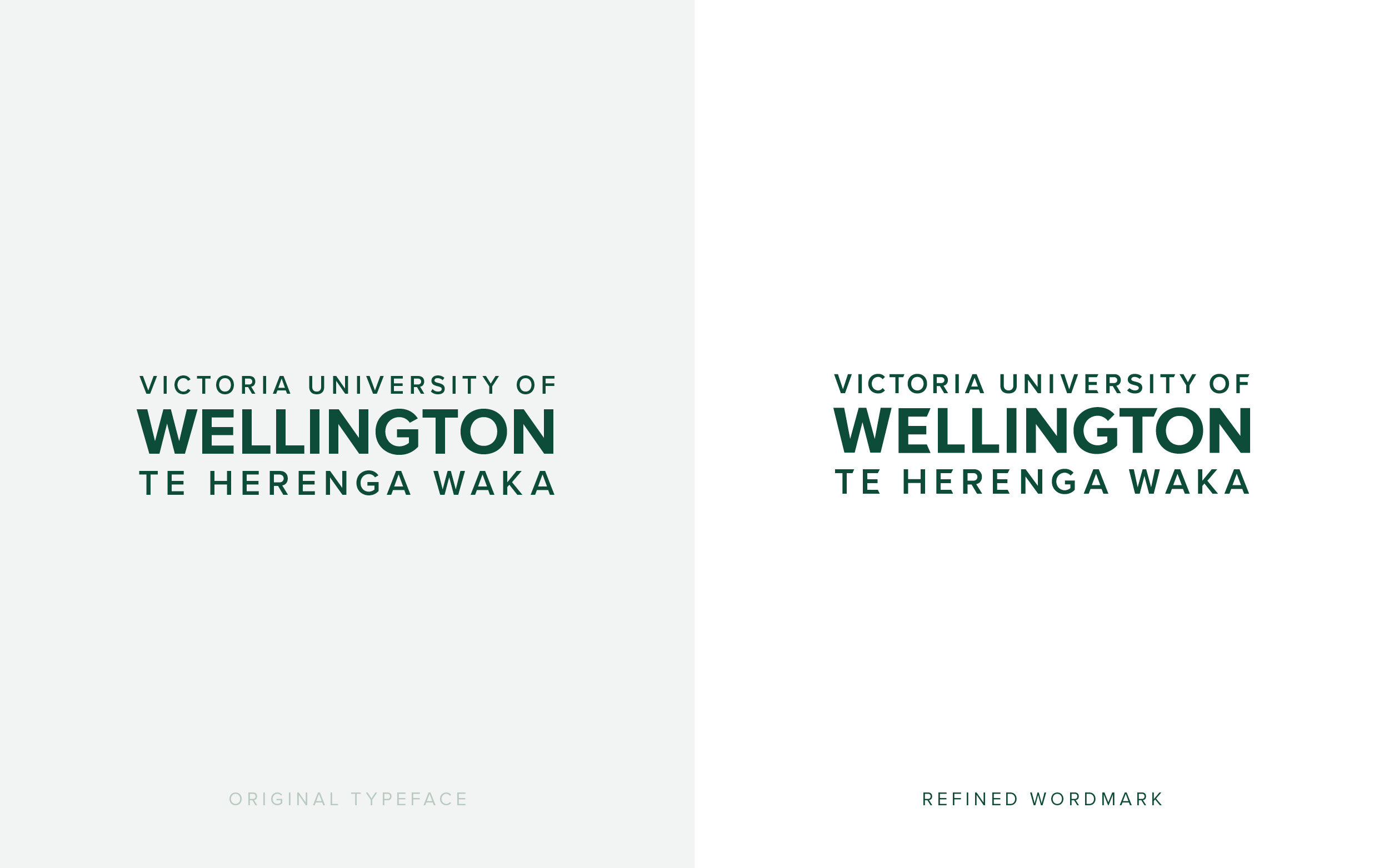

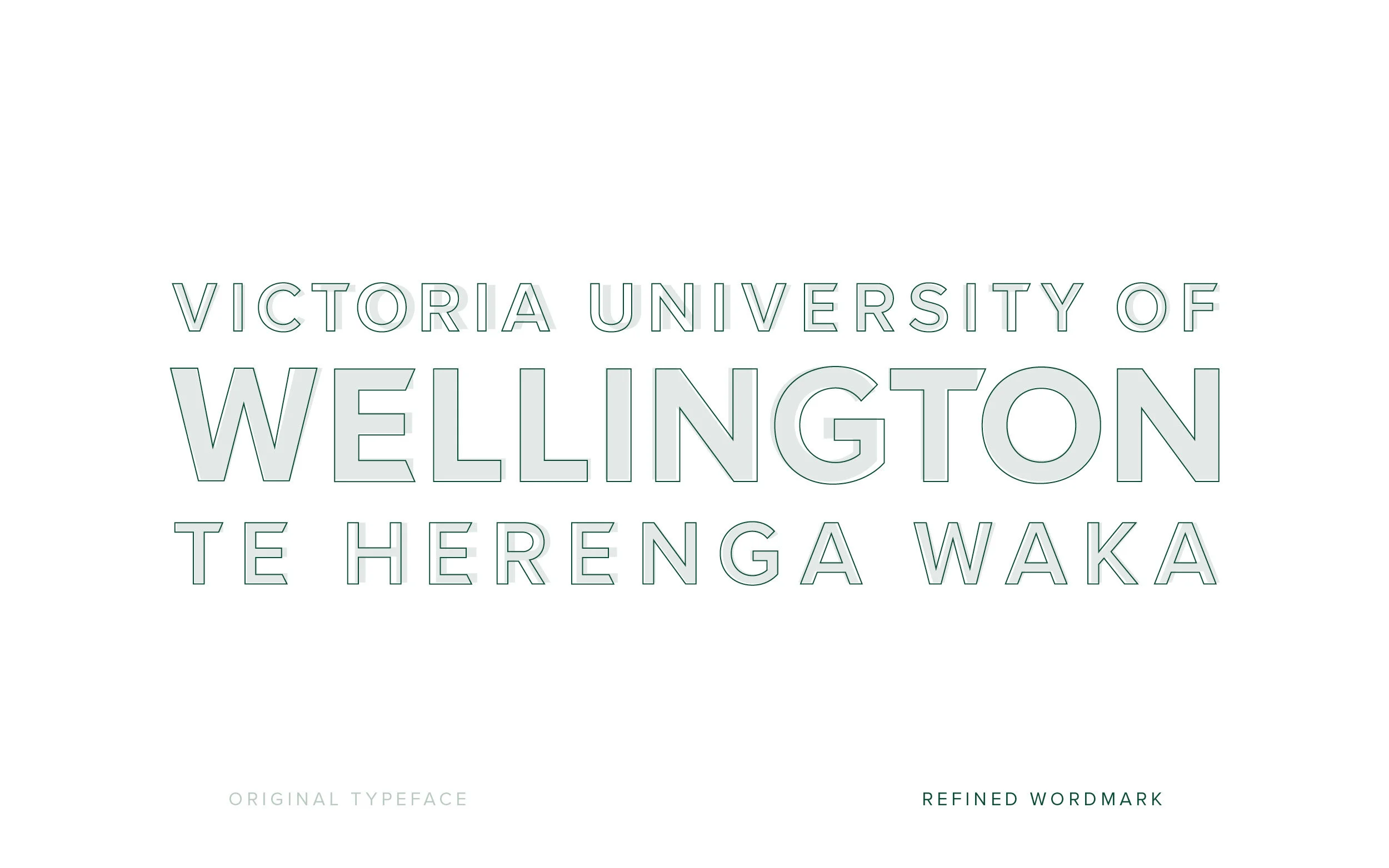

Well this is a controversial one, isn’t it? While waiting for the dust on this now infamous logo refresh to settle, I have been pondering the nature of the brief itself. The shield was already approved by the powers that be, which meant tweaks and small changes only. This whole project was an exercise in design crafting, refinement and restraint. ‘Wellington’ needed to be the key takeaway – putting to bed any confusion with the myriad of other universities called Victoria across the globe.
Such a big change to a logo that is near and dear to proud alumni was always going to be a challenge. We made the best of a restrictive process and allowed these simple shapes and letterforms to shine.
Completed at Insight Creative with Brian Slade and Edwin Hooper.