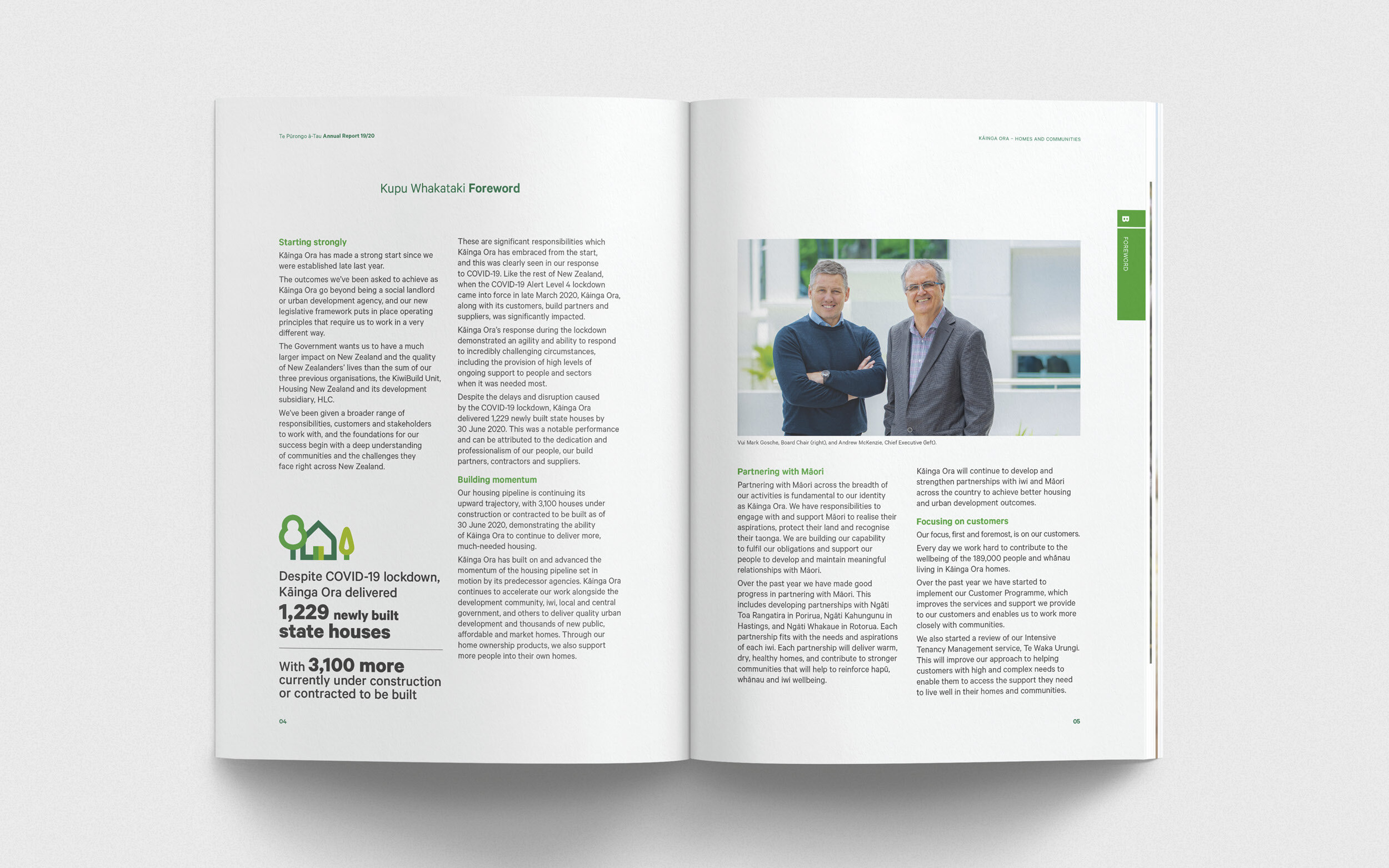
Kāinga Ora
Meaning ‘Wellbeing through places and communities’, Kāinga Ora strives to ensure Kiwis from all walks of life have a safe, happy and healthy home to call their own.


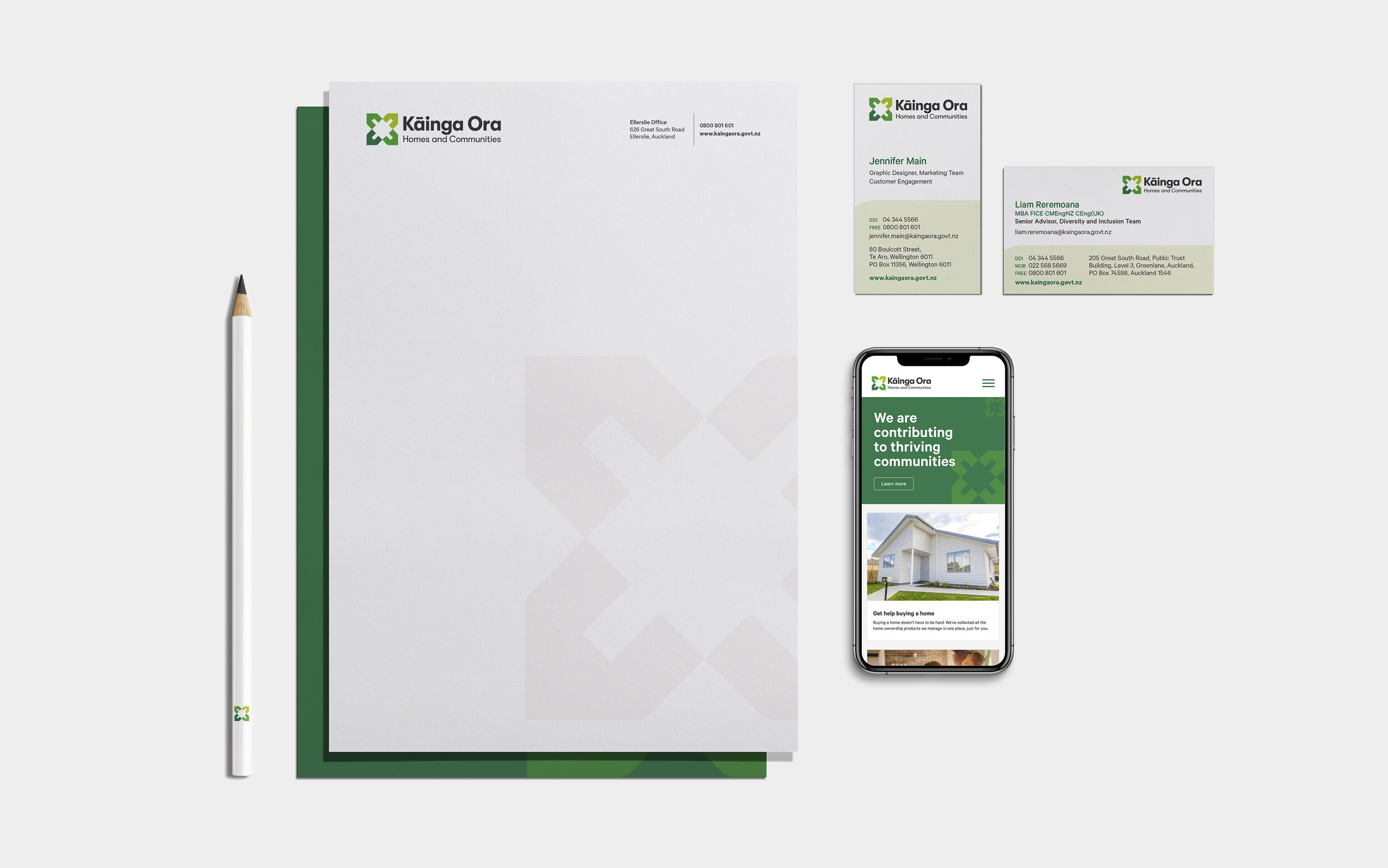


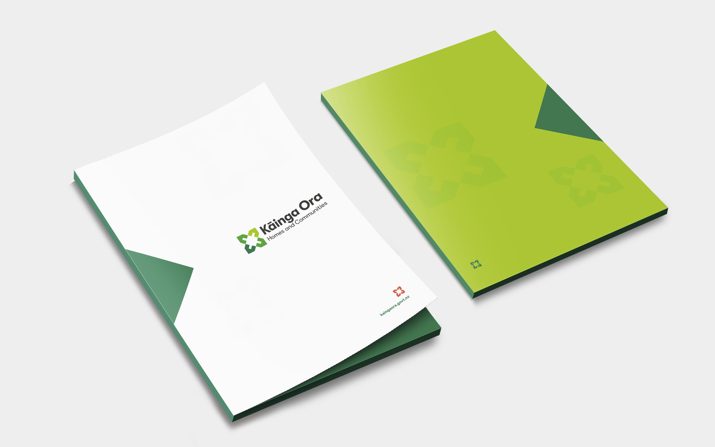

A new organisation with the same values. In October 2019, Housing New Zealand, HLC and Kiwibuild came together to form one organisation: Kāinga Ora – Homes and Communities. This new identity had to work hard to feel trustworthy and enterprising, but still collaborative, caring and community-focussed. This began with the logo icon – four houses formed into one flower-like pattern. The space in the middle is a shared, communal space, and the green tones imply sustainability and growth. The rest of the identity is a combination of whites, greens and pinks, creating a fresh and engaging suite of collateral. And what identity would be complete without custom iconography?
Completed at Insight Creative with Brian Slade and Edwin Hooper.